Now that the Holidays have come and gone I'm onto bigger and better things. Bigger meaning the 30"x40" canvas that I'm back to working on, and Better meaning "I hope this picture turns out better than I'm anticipating!"
I've been on the floor doing the finishing touches to get it completely ready for the painting stage. Here's the irony: I'm documenting the process step by step, and taking on the role of "teacher"— yet I've only worked with acrylics once in my life, and it was on a very small canvas. So the "teacher" can also be called the "student". I hope I learn a lot from myself... but mostly I hope it's not learning by major mistakes! The documentary photos were taken by me, so the images aren't fabulous quality. But I think you'll get the picture.
Here are the sequence of steps I've taken, so far:
2) To figure out the colors I want for the painting ahead of time I use Photoshop and experiment with different colors on my monitor. I use the LAYERS document, as it enables me to easily make changes to each individual image. I then print out the finished document for my review.
3) The black and white print-out (at the top) is the final result. This is also where I place the wording and experiment with different positionings. The bottom color print-out is the result of working and re-working with different colors in Photoshop. This is a rough draft, but it gives me all I need to see the color composition that I'll refer to while painting.
4) Here you see the sections of 8 1/2"x11" print-outs Scotch-taped together, and then taped along the top of the canvas to create the one big overlay picture that will be used to trace over.
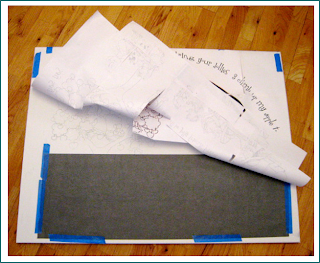
5) In this photo I've turned the overlay back so that the graphite paper that's taped between the canvas and the overlay sheet for tracing is visible to you.
6) This shows a closeup view of a section of the canvas where the graphite tracing has transferred onto the canvas.
I was thinking of naming the next blog entry COLOR-BLIND — but that's really being hard on myself!


